In the new SGP4.1 theme, can I retain the original icons and styles? The new theme, whether it is black or other colors, does not achieve the effect of the original interface simplicity and clarity. In addition, the theme’s support for Chinese is not good, and many characters are not displayed completely. SGP is the best astronomical automation software I have ever used, I love it, thanks a lot!
1 Like
No, sorry, but if you want to experiment with your own windows themes, SGPro will honor them.
Please expand on this. I am not sure what you mean in terms of “simplicity”. Have you tried using the “System” theme? It is as close as we can come to the original Windows-based theme and will also honor Windows themes.
This doesn’t have anything to do with themes right? This is to do with the general layout of SGPro or am I misunderstanding.
+1 for this.
The old theme was easy to read and clean, all the new themes are overpowering - far too much colour (Orange) everywhere.
I have tried the system theme but it looks exactly the same as the Light theme.
Maybe over time the Dev’s may consider creating icon sets of different colors so the user can choose the icon color they most like for the particular theme they have chosen to use !
1 Like
It’s possible, but unlikely at this moment unless there is a big interest in it. Otherwise, if most are neutral on the subject, we have an enormous backlog of things to get on with.
I hope so, I am retired now and my eyesight isn’t as good as it was despite wearing glasses. Trying to read white lettering against an orange background is difficult and the orange icons all look to have soft edges and are difficult to distinguish. No issue with the previous version but accessibility has reduced with this version.
1 Like
These are all super valid points. While making all new icons is a bit of a time consuming process, there are definitely easy fixes to the “not icon” stuff. That said, the only place I could find white on orange was the little tiny text on the progress bar. If you can tell us or show with screen shots where else you see these issues and we’ll get them fixed. White on orange is difficult without accessibility issues and that was never intended. I’m just being specific because it helps for things like this, but certainly other examples of low contrast areas that are difficult for you to make out are welcome.
As I mentioned above, the new theming engine makes colors easy and those can be corrected easily enough that we could make a whole new high contrast theme very quickly if it’s required. If only icons were as easy, but, because they are all “pre-drawn” they take time to correct.
I never really noticed before because I don’t spend much time in either of the lighter themes (just a personal preference), but those icons look smudged for sure. Here is an example with some small icons.
![]()

In both examples, the icons on the right side (light theme icons) look blurry and I dont know why off hand, but we’ll take a look.
Im no expert but it could be related to contrast/brightness settings of the screen.
We have a home cinema projecter in our living room and, if calibrating correctly, you use multiple special color test plates to help you get colors, brightness and contrast balanced. One if i remember was a white background with horizontal color lines, if things are not set right some of the lines appear to ‘bleed’ into the white background giving a fuzzy/ slightly blury look to the edge. Its feasable especially on the light theme that this visual effect is happening here.
It is very common for people to have their screens way too bright either by using too much brightness or too much contrast or both. I discovered this once i started using Pixinsight and a ‘finished’ image would look completely different on my screen compared to others and sending an image for print was almost embarrassing lolol I now have a ‘pro’ screen which gets color calibrated monthly , it takes quite a while to get used to a color calibrated screen i can tell you cos it appears so dim.
‘Midnightlightning’ makes a valid point ref the original icon set used by SGP before the themes and orage orange orange came along, i actually prefered this ‘professional’ clean pin sharp look, although, dont get me wrong, themes is a smash and i love it. The orange icons make SGP look more like APT for me. If SGP’s original icons were made available as an option to work with the themes that would be my one stop shop with my chosen ‘dark’ theme.
Please dont take this point as an insult as it is not meant that way guys, just my opinion.
Paul
Thanks for replying Ken.
Yes, I think the white on orange writing is only on the progress bar in the LIght theme.
Whilst not a major issue the darker themes also use white writing, this time on grey, which I also find is more difficult to use.
I don’t want to cause a big issue with rewriting icons etc, I can manage to use the new interface and have already docked the most often used icons.
However, for information I think there are two weaknesses with the icons. The orange does look fuzzy, and to use an Astro analogy, it’s like they have been made using Chrominance when Luminance was needed - it is hard to see details in them.
The second weakness is that many icons look very similar, for example look at how many circles are used. A strong icon should immediately indicate its function, and perhaps its just me, but as a long term user of SGP I am having to hover over various icons to get the pop-up saying what it does, it must be harder for new users. The icons should really be self-explanatory and personally I find several are not intuitive.
I hate to say it but, for me the old crisp UI was much easier to see and use.
You mention a high contrast solution, I am not sure what that would look like or whether it would help. I have the brightness on my monitor set to minimum in the observatory for obvious reasons. Just trying it on highest brightness and the icons are easier to see and use. I wouldn’t use high brightness in practice but perhaps it is useful information.
I don’t know whether it is technically difficult but perhaps you could consider having a “Classic SGP” theme like Windows had and just allow the old theme and icons to be used?
In summary, I find the new themes harder to use and personally don’t like them. However, I can use them and I accept you can’t please everyone all of the time. I hope you will take my feedback constructively, al the hard work in making improvements is appreciated.
1 Like
You mean as opposed to black? In my opinion black on dark gray is very hard to read.
This is true of both “old” and “new” icons and isn’t specific to the new theming. While I don’t disagree, SGPro is not a huge money maker and as of now, we can’t afford to have custom icons for astronomy made. As such, we make due with general icon sets the best we can. If only one of us was an artist…
Aside from icons, this is just a matter of colors and colors can be tweaked. Also… we are looking at icon blurriness in light themes as well.
This is not currently possible to be exactly like 4.0, but it can be more like it. It’s not released yet, but I have already made changes to the system theme to match colors to the old theme exactly where possible. Again, an exact match is not possible without really messing the other themes up.
Ignoring the icons which I have not looked into just yet, here is the sequencer with the new system theme… a much closer match (note that it’s blurry because the forum compressed it… not actually blurry, click on it to see the not compressed version)
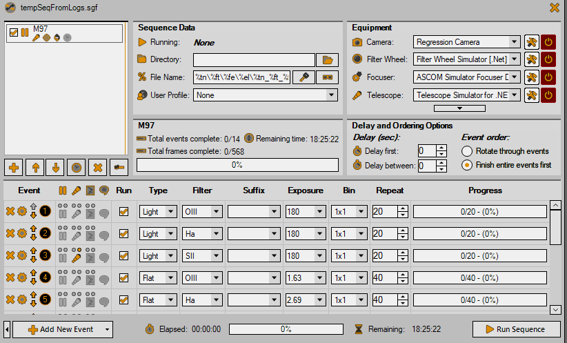
I think that this plus sharper icons should make traditional windows UI enthusiasts happier.
1 Like
This is just a sample… updating icons is a bit of a slog and will take a little time, but still looking for feedback. Thoughts?
Yes, I agree.
Looking good Ken. I appreciate your time to discuss this and seek improvements. This looks much better ![]()
Ok, well, I have made a bunch of changes to all the themes and found a couple places where an attempt to internally scale / resize an image caused it to be blurry also. It doesn’t really take a lot longer to redo icons for all themes (than it does to redo them for all themes). As such, I have started making new icons:
- That are less colorful, but are not wholly monochrome or grayscale (just less busy where a good deal of the icons are just a single solid color and not multiple colors… pretty similar to the icons in 4.0)
- Where the smaller icons (16 x 16) do not have an outline. It turns out that this is the primary cause of the blurry appearance… when the icons have an outline and then they are shrunk to 16x16, they don’t turn out great. The larger icons still have an outline because it helps to distinguish them from the background in the dark theme.
- Where the traditional SGPro orange has been changed to more of a bronze color… less bright and therefore less likely to have fuzzy (looking) edges (so the experts say anyhow). It was important to me to at least pick a color that is compatible with SGPro orange so that we don’t need to take it into consideration for existing logos, marketing materials, etc.
With respect to the themes (colors):
- The system theme is as close as I can get it to traditional Windows UI colors without affecting larger areas that I would like to avoid at present.
- The SGPro orange has, like the icons, been reduced to a darker bronze-like color (e.g. the little circle numbers on the event rows, lots of other little widgets, etc)
- All title bars now use a background color that has good contrast with the window’s control buttons (close, minimize, etc)
If can stop myself from spacing out and staring at the wall for hours at a time, I think I can make a release this weekend that actually has these changes.
1 Like
Very much appreciated Ken - apologies for causing you more work.
No worries about this. We don’t want themes to exclude or make it harder for anyone to use. The initial reluctance while at least partly about the time required to make the changes was mostly rooted in the fact that opposition was just opinion… likes, dislikes. I decided to do the work because your feedback was meaningful, fact-based, oriented toward usability and steered mostly away from your personal tastes. It is certainly appreciated.
A note… quite a few theme changes will be released today. While I think they mostly be appreciated, these new color schemes have not been thoroughly tested for proper contrast in every aspect of SGPro. If you or anyone detects things that are now difficult to see because of them, just post them somewhere.
2 Likes
@ken. Just managed to download the update, looks great, much easier for me to use. Many thanks.
1 Like